“A designer should have a willingness to read the material, to discuss it thoughtfully and passionately, and to develop visual components that expand the read while still working within the publication's architecture.”

~ Martin Venezky, Art Director, Speak magazine
{Art Direction and Editorial Design by Yolanda Zappaterra (Abrams Studio)}

Plan International

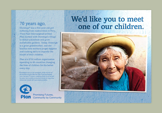
A stock image represents the people Plan has helped over the past 70 years, a rustic background ads texture and interest to the ad. The lighting and shadow create depth and draw the eye in.

Plan International Ad Campaign

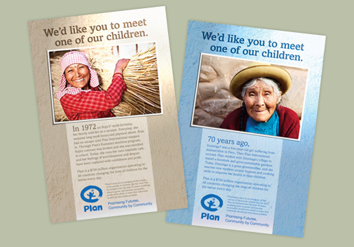
Multiple ads were created using the same theme in various sizes for a variety of publications throughout Plan International's Ad Campaign.

Tepui Tents

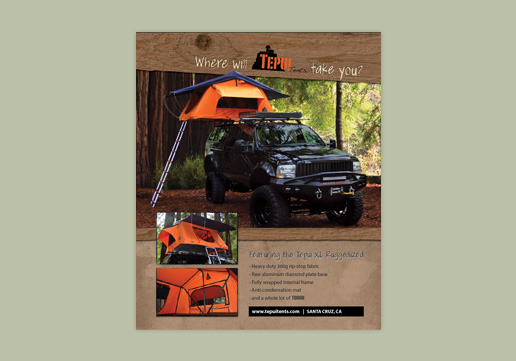
Tepui Tents full page ad for the Overland Journal.

Veterans Moving Forward Partnership Ad

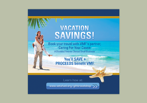
This in-house advertisement was designed for Veterans Moving Forward's newsletter, Milestones. We couldn't find the right image within budget, so we combined the image of the couple, palm frond, and beach to create the main image.

Veterans Moving Forward Gift Shop Ad

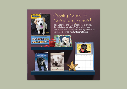
This in-house advertisement was designed for Veterans Moving Forward's newsletter, Milestones. The image was digitally composed in Photoshop.

Hire A Hero

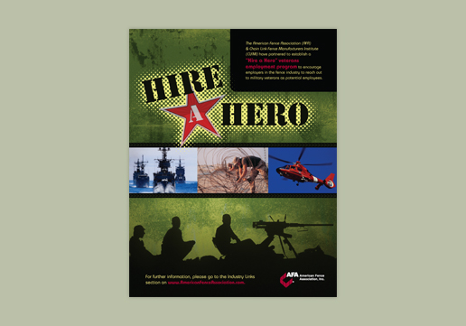
The American Fence Association wanted to create ads of several sizes to be on hand for their magazine, Fencepost, to encourage employers in the industry to hire military veterans.

TRAU Email Ad | GD USA Award Winner

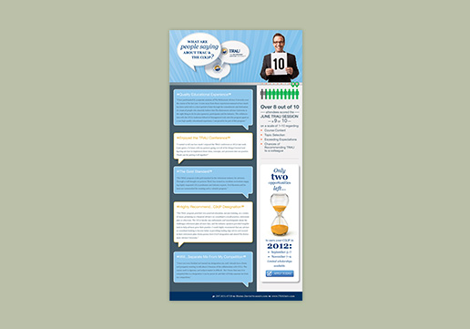
The Retirement Advisor University (TRAU) uses email advertising to educate industry professionals on the value of their designation. We used their brand’s background pattern and two separate images (speech bubbles and the business man) to create this unique email header.

TRAU Email Ad | GD USA Award Winner

It was important to show a diverse group of business professionals for TRAU’s email advertising their upcoming Group Study Sessions. We also used iconic images from the sessions corresponding locations to encourage excitement in signing up.

TRAU Email Ad

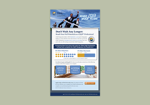
This email ad includes business professionals winning a race and reinforces the seize the day sentiment. Winning ties into the graphics that show that industry professionals who earn the designation are more successful than those who do not.

TRAU Email Ad

We selected images that reinforce the text in this ad — the lone seat ties into the "Don't be left out!" text and the alarm clock with the registration deadline. TRAU's brand colors are blue and orange so we manipulated the images to use their orange as the call-out color.

Take the Leash Facebook Ad

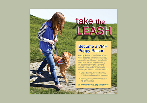
When we selected this cute photo for Veterans Moving Forward’s (VMF) Puppy Raiser campaign, the headline practically wrote itself. A play on the phrase “Take the Reins” — the headline and image pair perfectly. This ad appeared on VMF’s Facebook page.

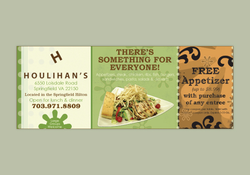
Houlihan's

By studying Houlihan's website, we were able to mimic their identity to create this Valpak insert consistent with their brand.

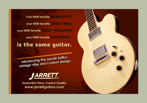
Jarrett

This custom guitar shop needed ads created for Premier Guitar and Vintage Guitar magazines. We removed the guitar from it's background and placed it on the high contrast burgundy background.

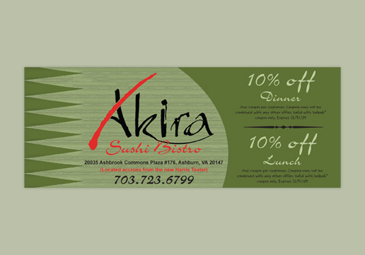
Akira

Photos typically dominate Valpak inserts so in order to stand out from the crowd we relied on graphic elements influenced by the grass dividers found on sushi plates, and texture for an illustrated feel.

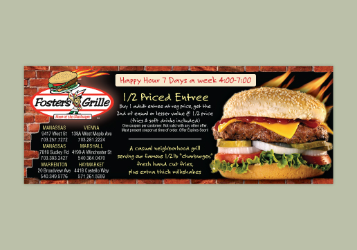
Foster's Grille

Used Foster's branding to design and layout advertisement for Valpak insert.

Miracles Salon & Spa

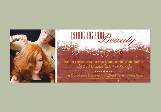
The color scheme for this Valpak insert was influenced by the red head in the photo and the design reflects the Winter Holiday Season when this ad was running.

Dupont Pet Stop

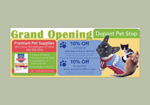
Valpak inserts tend to be boxy, so we used rounded corners and text along the borders to break the ad space. We also silhouetted the animals and placed them strategically to give the illusion of depth.

Veterans Moving Forward Newsletter Ad | GD USA Award Winner

We combined 2 photos, one from Shelley Castle Photography (shelleycastlephotography.com), the other a stock photo, to create the image you see here with lots of space for the ad copy.

TRAU Magazine Ad | GD USA Award Winner

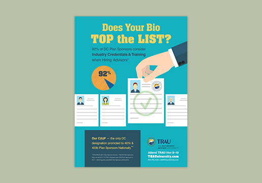
Using Adobe Illustrator, we altered a stock illustration to create a custom graphic for this clean, uncluttered advertisement that stands out in contrast to the information-heavy magazine it appears in.

  • Advertisements// 1/ 2/ 3/ 4/ 5/ 6/ 7/ 8/ 9/ 10/ 11/ 12/ 13/ 14/ 15/ 16/ 17/ 18/ 19/
  • << Previous | Next >>

Advertisements

Working with marketing consultants, public relations management, copy editors or small business owners, we can take your ad copy, ideas or photos and turn them into reality.

Advertisements are made up of five basic elements; the visual, headline, copy, signature and oftentimes an offer. We’ll ask you questions about your business, like who is your target audience and competitors, what are your brand guidelines, and what is the main goal of the ad. This will help us create the right hierarchy for the ad, find the right photos, illustrations or fonts and nail down an ad design that fits your marketing strategy.

We can maintain the integrity of your ad across various publications, mediums and sizes so that it stays on brand and maintains impact everywhere it is seen.

Contact us for a free estimate today >>