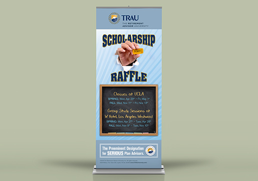
The Retirement Advisor University (TRAU) | GD USA Award Winner
33 x 80" Aluminum Retractable Banner Stand for TRAU's booth at The NAPA 401(k) SUMMIT. We used the Blue Rays we designed for their identity in the background to stay on brand, and we manipulated the stock photo of the hand to look like it was bursting out of the banner.
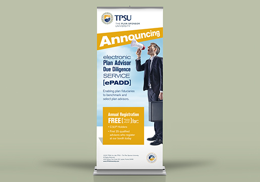
The Plan Sponsor University (TPSU) | GD USA Award Winner
For this 33 x 80" Aluminum Retractable Banner Stand for TPSU's booth at The NAPA 401(k) SUMMIT, we wanted a life-size image of a business professional with a megaphone to span the vertical banner. The stock photo's background wasn't appropriate, but we extracted him to make it work.
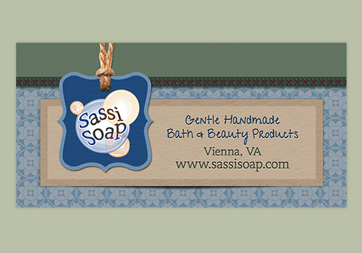
Sassi Soap | GD USA Award Winner
We used the design elements that we created for Sassi Soap's ecommerce website to reinforce the brand in this horizontal hanging banner for their Farmer's Market booth.

Caribbean Relief Fundraiser | GD USA Award Winner
Caribbean inspired design for a fundraiser benefiting several initiatives in the Caribbean including Haiti and Jamaica. The event was held by the Reston Rotary Club at a local Jamaican restaurant featuring live Reggae music.
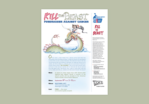
Kill the Beast
A fundraiser for the American Cancer Societys Cancer Action Network named after the saying of a little boy who dressed as a pirate to "Kill the Beast" when going to chemo. To adequately represent this sensitive topic and unique vision we worked with illustrator, Christopher Rule, who provided just what we were looking for.
The Story of Freedom
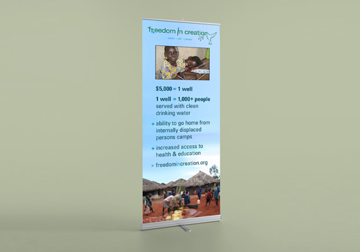
This traveling art exhibit by former child soldiers and slaves of Northern Uganda raises money for wells and allows the children to participate in bringing fresh clean water to their communities. The 33 x 80 inch banner stand quickly explains to viewers at the exhibit how much one well costs and how many people it serves.
The Story of Freedom
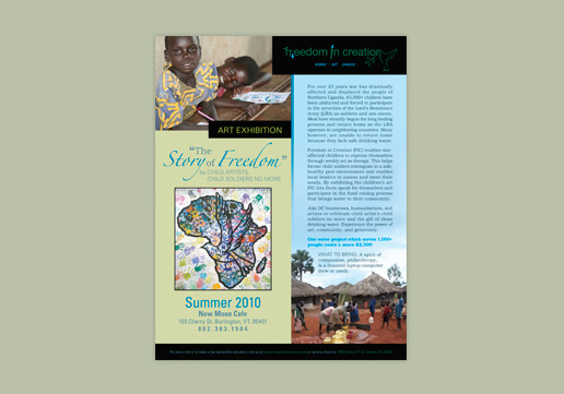
This traveling art exhibit by former child soldiers and slaves of Northern Uganda raises money for wells and allows the children to participate in bringing fresh clean water to their communities. The 8.5 x 11 inch event flyer explains the who, what, where, when, and why for the exhibit.
The Story of Freedom
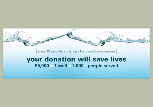
Former child soldiers and slaves help bring water to their communities through art that Freedom in Creation exhibits during fundraisers to raise money for wells in Uganda. 5 Gallon water jugs are branded with the label above and used at the event to collect donations for the wells.
Project Inspiration | GD USA Award Winner
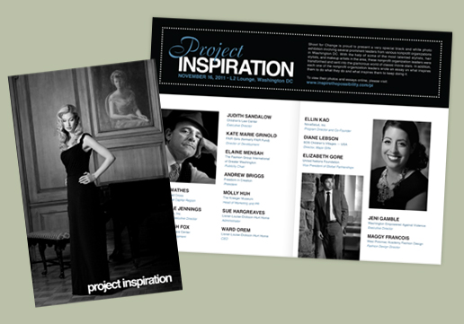
Project Inspiration was a black and white photo exhibition held by Shoot for Change featuring Old Hollywood fashion editorial photos taken by Walter Grio. The event highlighted and raised money for fifteen various nonprofit organizations. This program featured some photos, listed the non-profits and thanked the sponsors for the event.
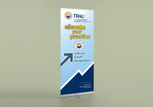
The Retirement Advisor University
This 33 x 80 inch conference banner stand is branded with TRAUs logo, designation, colors, and graphic elements for their booth at an industry summit. The headline is large enough to be read by conference attendees up to 150 feet away with maximum impact up to 40 feet.
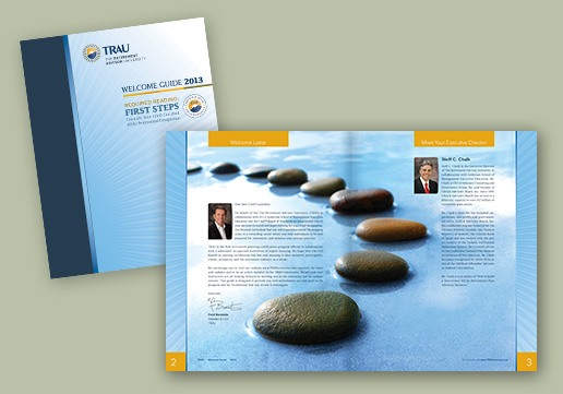
The Retirement Advisor University
TRAU's Welcome Guide for students attending their on-campus classes is a 24 page, 8.5 x 11 inch saddle-stitched booklet. The image in the spread corresponds to the "stepping stones" reference in the Welcome letter from the Founder.
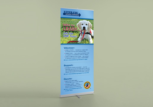
Veterans Moving Forward
The 33 x 80 inch banner stand with Veterans Moving Forward's brand grabs viewers attention with the puppy holding his own leash. Up close it delves into how you can volunteer, support or donate to help the cause.
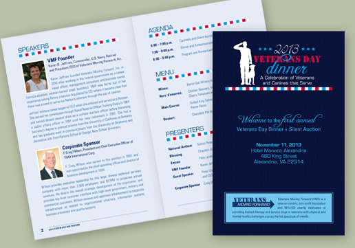
Veterans Moving Forward
This 5.5 x 8.5 inch 8 page saddle-stitched event program was designed for a fundraising dinner held by Veterans Moving Forward on Veterans Day. It outlined the speakers, agenda, menu, presenters, silent auction, and gave thanks to sponsors.
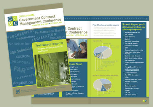
National Contract Management Association
NCMA's design department was overwhelmed and came to us to lend a hand. We created this 12 page saddle stitched direct mail brochure based on the campaign pieces they previously designed.
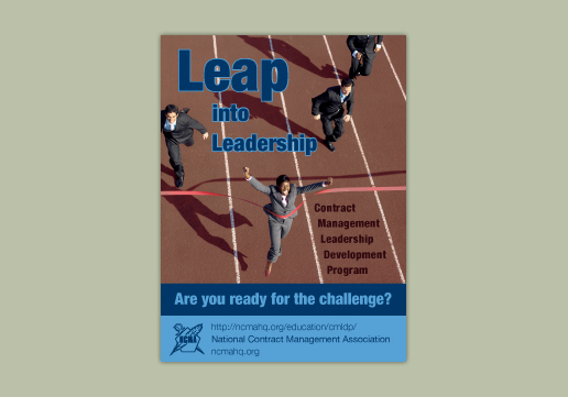
National Contract Management Association
NCMA asked us to design signage not for a specific conference, but rather one that could represent them at any conference using their everyday NCMA brand.
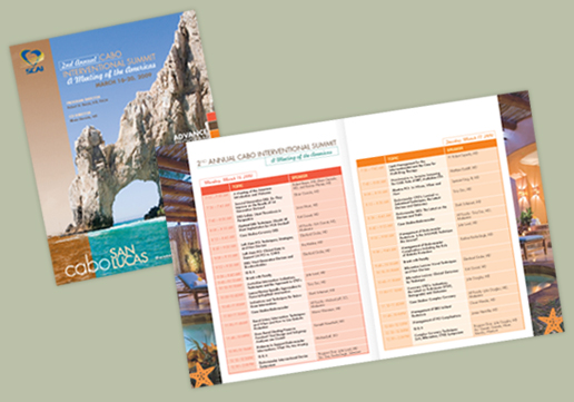
Society for Cardiac Angiography and Interventions
For the Second Annual Cabo International Summit, SCAI only needed their previous year's program revamped using the same layout, so new photos, page elements, and agenda tables were added.
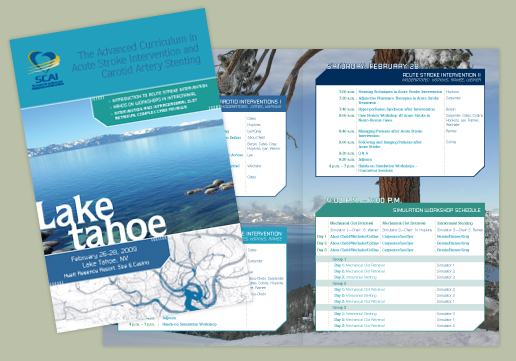
Society for Cardiac Angiography and Interventions
The preliminary and advanced brochures were designed using a combination of stock and photos provided by the Hyatt Regency Resort, where the program took place.
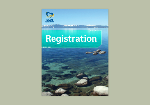
Society for Cardiac Angiography and Interventions
The program's signage was designed to match the preliminary and advanced programs to create a cohesive and easily recognizable brand for attendees of the conference.
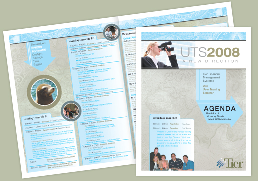
Tier Technologies
Based on a banner ad and the slogan, "A New Direction", for their User's Training Seminar, we elaborated on the theme adding graphic elements such as arrows and maps to the agenda.
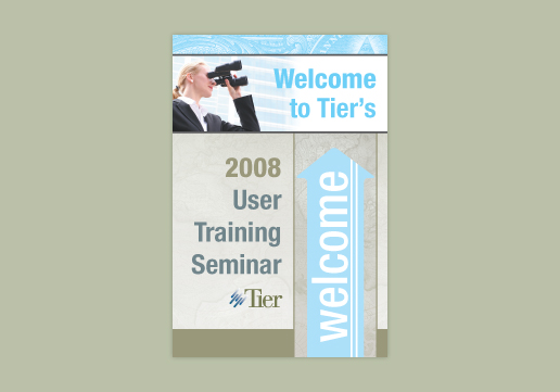
Tier Technologies
We carried the established theme of the conference through to include conference signage, pocket agendas and presentation graphics to tie it all together.
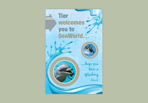
Tier Technologies
Attendees at the Users Training Seminar were treated to a show at Sea World. For this event, we deviated from the conferences traditional theme to include fun water splashes.
Veterans Moving Forward (VMF) | GD USA Award Winner
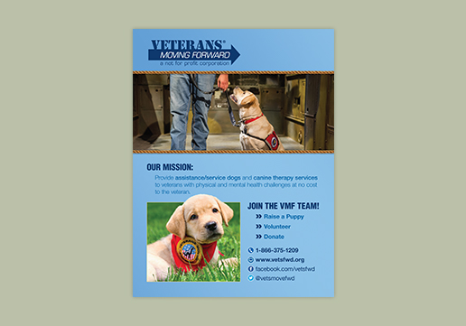
An 18 x 24 inch poster advertising the need for puppy raisers, volunteers and donations incorporating the VMF brand and photos by Shelley Castle Photography: shelleycastlephotography.com.
The Retirement Advisor University
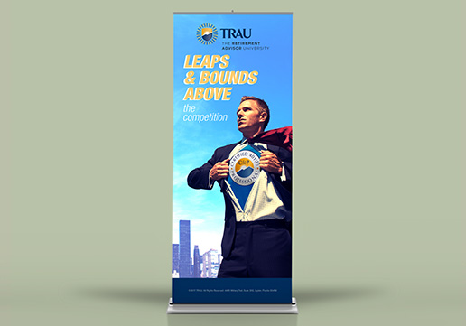
This event banner stand adds presence to the event booth and conveys the company's message using a fun play on Superman. We used Adobe Photoshop to make it look like the certification's logo was on the Retirement Advisor's t-shirt.
NAMI Northern VA | GD USA Award Winner
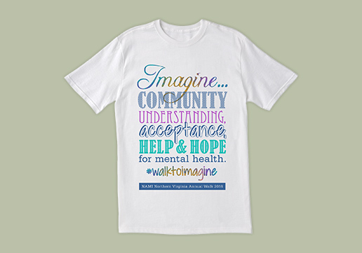
Since the statement for the shirt was long, we opted for a typographic design to maximize space and legibility from a distance. To stay under budget, the design was limited to 4 spot colors, but, by using creative design techniques, the word Imagine looks like a rainbow of colors.
<Playback Stop Play >
- Event Materials// 1/ 2/ 3/ 4/ 5/ 6/ 7/ 8/ 9/ 10/ 11/ 12/ 13/ 14/ 15/ 16/ 17/ 18/ 19/ 20/ 21/ 22/ 23/ 24/
- << Previous | Next >>
Event Materials
Let us implement your event theme across brochures, programs, and handout collateral. We’ll entice your members with creative direct mail pieces and carry the brand through with conference signage and banners.
Don’t have a theme. Let us help you...


