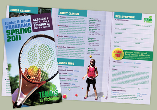
Tennis at Tuckahoe | GD USA Award Winner
This three fold brochure is 8.5 x 14 inches in size offering wider panels than a traditional 8.5 x 11 brochure. We manipulated the cover photo to look like the Tennis at Tuckahoe logo was imprinted on the racket, used balls instead of bullets, and strategically placed artwork to balance text.
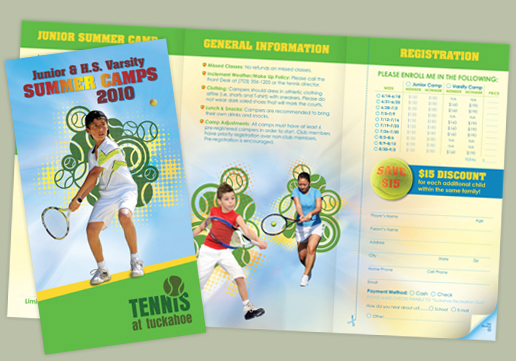
Tennis at Tuckahoe | GD USA Award Winner
This three fold brochure is 8.5 x 14 inches in size offering wider panels than a traditional 8.5 x 11 brochure. We wanted the brochure to feel like summer and look fun and inviting for the kids.
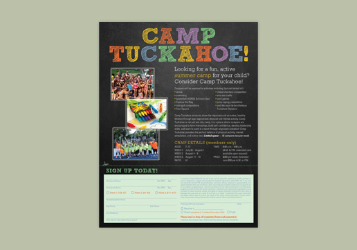
Camp Tuckahoe | GD USA Award Winner
The 8.5 x 11 inch flyer includes camp description, registration form, and an educational (chalkboard) theme to help convey that the camp is built around learning skills and activities.
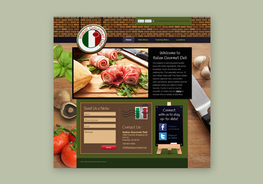
Italian Gourmet Deli | GD USA Award Winner
Custom designed website for Italian Gourmet Deli: italiangourmetdeli.net.
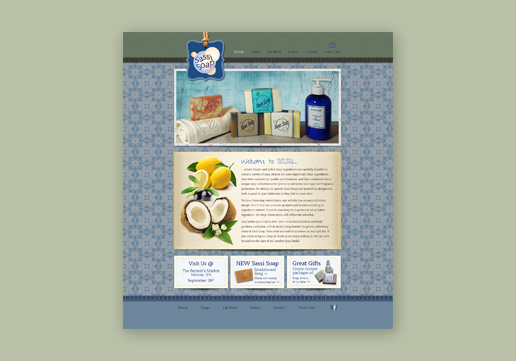
Sassi Soap | GD USA Award Winner
Custom designed website for Sassi Soap: sassisoap.com. The background pattern for this online store was inspired by the Sassi Soap mold design.
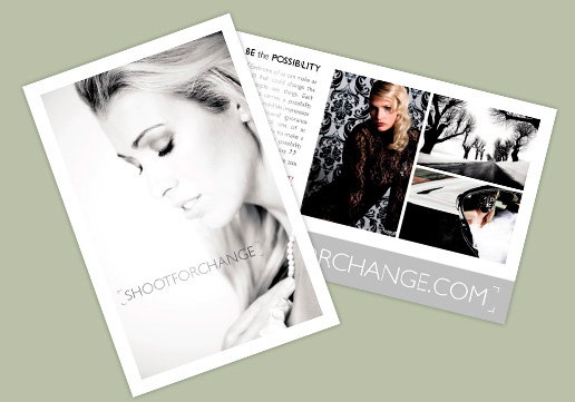
Shoot for Change
Shoot for Change is run by photographer, Walter Grio, who uses photography to raise money for non-profits. This informational postcard handout is offered at fundraising events to display the photography and spread the word about Shoot for Change and increase participation. Learn more at: shootforchange.com and "Be the Possibility."
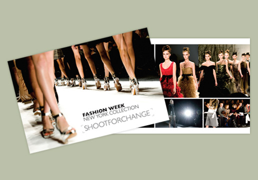
Shoot for Change | GD USA Award Winner
In addition to donating photo shoots, Walter uses the proceeds from the sale of his prints on canvas to benefit non-profits as well. This postcard advertised the sale of prints from Fashion Week's New York Collection to benefit the Lisner-Louise-Dickson-Hurt home. Learn more at: shootforchange.com.
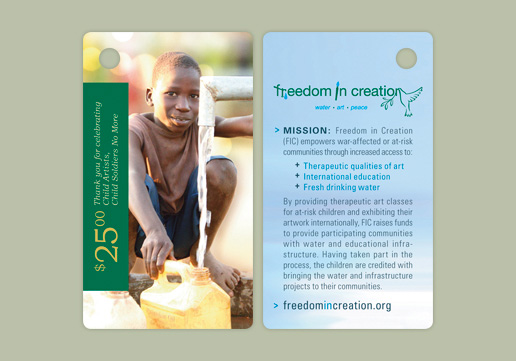
Freedom in Creation (FIC) | GD USA Award Winner
Former child soldiers help bring water to their communities through art that FIC displays at fundraisers to raise money for wells in Uganda. In addition, they sell shirts with the artwork and wanted a t-shirt price tag that doubled as a take-away containing FIC's mission and website, so buyers could continue to help after leaving the event.
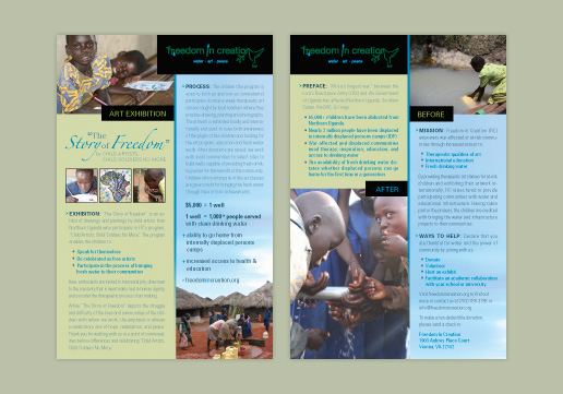
Freedom in Creation (FIC) | GD USA Award Winner
The Story of Freedom is a fundraising exhibition of art by former child soldiers and slaves from Northern Uganda. The exhibit raises money for wells and allows the children to participate in bringing fresh clean water to their communities. This 6x9 inch postcard explains the exhibit, process, need, mission and the ways to help.
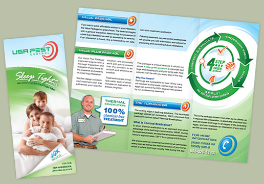
USA Pest Control
USA Pest Control uses safe, green-treatment solutions. A clean, green brand was created for their 8.5 x 11 inch tri-fold brochure, along with a custom chart explaining their 4-step process. The shape of their logo was repeated throughout the design, including the chart to reinforce their brand.
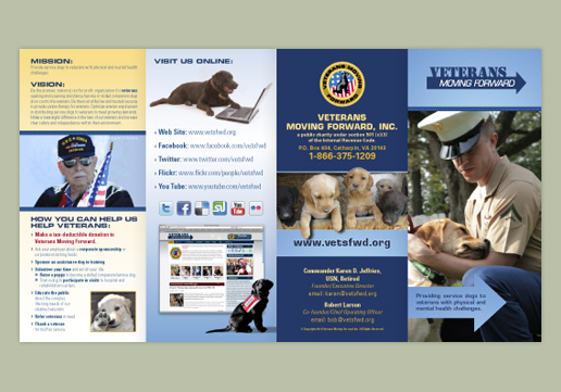
Veterans Moving Forward (VMF) | GD USA Award Winner
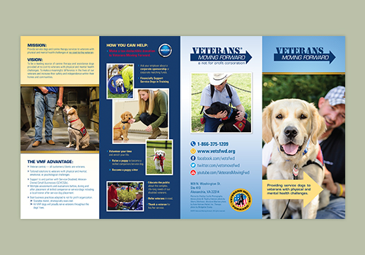
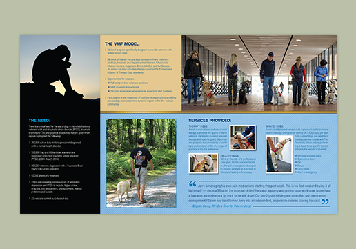
VMF is a 501(c)3 not-for-profit whose mission is to provide service dogs to veterans with physical and mental health challenges. They depend largely on donations and volunteers for support. This 4-panel, 9 x 16 inch, roll-fold brochure explains their mission, vision, the need, services provided, ways to help, and of course, cute photos of dogs.
Veterans Moving Forward (VMF)
We revised and redesigned VMFs 4-fold brochure with updated information and new photos taken by VMF volunteer photographers. The new photos show VMF volunteers, trainers, service dogs in training, and veterans who have benefited from VMF. Photo cropping and angled shots allow some veterans to remain anonymous. (Outside)
Veterans Moving Forward (VMF)
We revised and redesigned VMFs 4-fold brochure with updated information and new photos taken by VMF volunteer photographers. The new photos show VMF volunteers, trainers, service dogs in training, and veterans who have benefited from VMF. Photo cropping and angled shots allow some veterans to remain anonymous. (Inside)
Veterans Moving Forward (VMF)
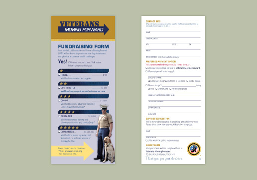
This donation form was designed as an insert to fit inside the VMF tri-fold brochure. It is also available as a form-fillable PDF online so that users can type into it in Adobe Reader, save their information and email it back.

ABC Garage Repair
Marketing is not just for pre-sales after ABC Garage Repair finishes a job, they add a leave-behind sticker that says thanks and promotes their website where the customer can find additional savings and maintenance plans.

Pathfinder Payment Solutions
The company wanted to decorate the office with their new brand and display their core values so we created these 22x28 inch posters. We couldn't find a stock photo that was exactly right for "integrity", so we merged these three separate photos together to create the desired message.

Pathfinder Payment Solutions
Again we were challenged to find an image that represented "value". We were able to use this image by changing her red marker and suit liner to orange, one of Pathfinders brand colors, and adding the diagram to compliment the message.

Pathfinder Payment Solutions
To make this poster have a little more impact, depth and interest we manipulated the photo to look like their hands were popping over the blue frame.

Pathfinder Payment Solutions
Once these 22x28 inch posters were created, we then translated them into 4x6 foot banners to be displayed in a different location.
WiHiFi
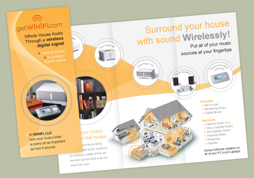
In order to design this three panel brochure for wireless music, we had to visualize sound before we could illustrate sound waves and pulsing.
Doyle Construction | GD USA Award Winner
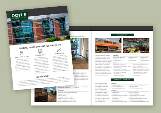
We were able to pick up and follow Doyle Construction's brand from their website design to create this 4-page, 8.5 x 11 inch marketing brochure.
TopNotch Tennis | GD USA Award Winner
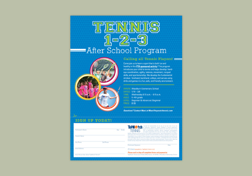
This marketing flyer is sent out to parents to tell the who, what, where, when, and why for TopNotch Tennis After School program and includes a registration form for easy sign up.
TopNotch Tennis | GD USA Award Winner
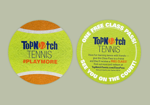
TopNotch Tennis wanted to create a unique promotion to hand out to current students that would encourage their friends to try the class. We designed this circular Free Class Pass in the form of a tennis ball using felt-weave paper so that both shape and texture lend a distinct impression to the recipient.
TopNotch Tennis | GD USA Award Winner
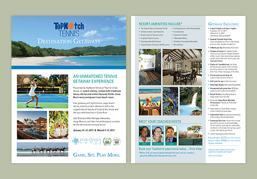
TopNotch Tennis Destination Getaways Flyer relies heavily on large, beautiful photos of the resort, amenities, activities and excursions to promote the packages and is balanced by a uniform hierarchy of text for easy reading.
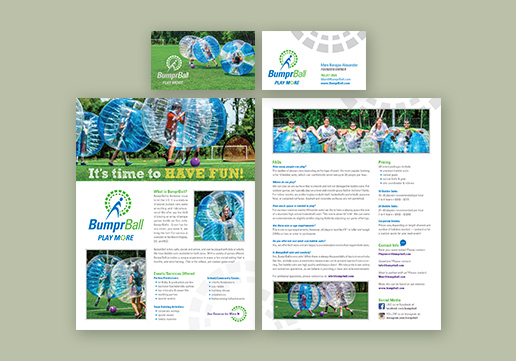
BumprBall | GD USA Award Winner
We designed this new start-up's brand including their logo, business cards and flyers. We used a fun font for the headline of the flyer to reflect the excitement of the game, added design details from the logo and balanced text and photos to create a user-friendly layout.
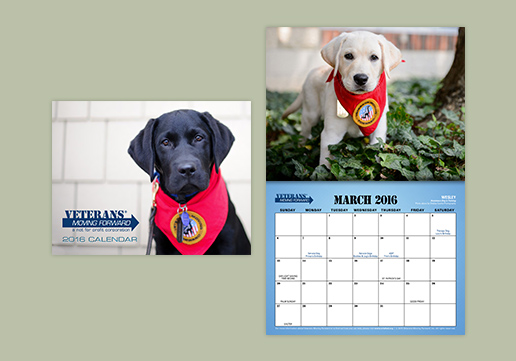
Veterans Moving Forward (VMF)
We designed VMFs 11 x 17 inch, folded to 8.5 x 11 inch, 14-month calendar with their brands blue pattern, logos, and VMF dates using full bleed photos of their service dogs for each month.
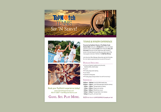
TopNotch Tennis
The challenge was to find the right photos to portray this unique and exciting event combining tennis and a trip to a winery. We also used burgundy and green to give the feel of a winery, and changed the color of the court from red to blue to match the modern courts at the club.
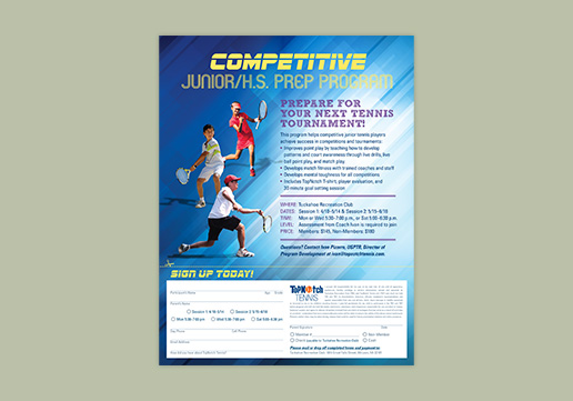
TopNotch Tennis
We selected a font for the headline that conveyed action and sports, and using Adobe Photoshop, we removed the tennis players from their original photos, added them to the flyers background, and created shadows for each to ground them and give them dimension.
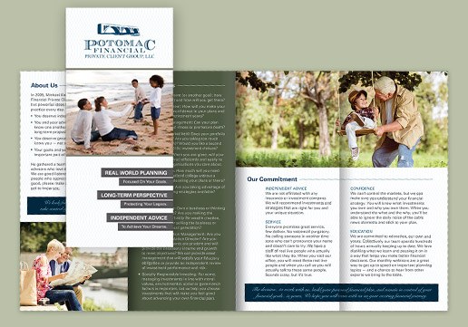
Potomac Financial Private Client Group
After redesigning this brand, we incorporated the brands elements to develop two brochures with the same information at different sizes; one 9x16 inch 8-panel brochure and the other a Letter-sized 4 page brochure. These were also printed on FSC, SFI, and PEFC Certified paper using non-toxic dry-based inks.
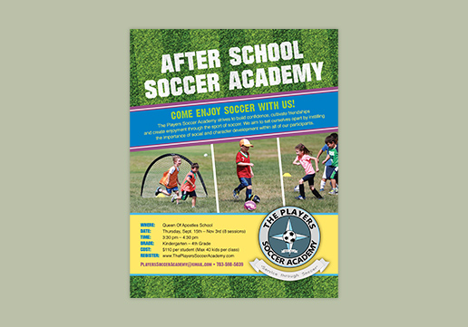
The Players Soccer Academy | GD USA Award Winner
Using a combination of client-provided photos and a stock photography, we designed an 8.5x11 inch flyer and matching 11x17 inch poster for this after school soccer program. We used angles and image overlaps to create a fun design that reflects the atmosphere of the program.
<Playback Stop Play >
- Marketing Collateral// 1/ 2/ 3/ 4/ 5/ 6/ 7/ 8/ 9/ 10/ 11/ 12/ 13/ 14/ 15/ 16/ 17/ 18/ 19/ 20/ 21/ 22/ 23/ 24/ 25/ 26/ 27/ 28/ 29/ 30/ 31/
- << Previous | Next >>
Marketing Collateral
Your company should look the same no matter where it is seen, including it’s stationary, envelopes and business cards, but also the sales collateral, like flyers, brochures, folders and other visual aids your company uses. We’ll make sure your business collateral is wearing the approved uniform and making the right impression with viewers.


