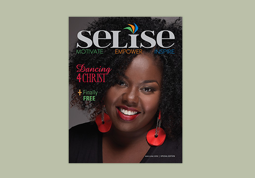
Selise Magazine
We photo edited and designed, from top to bottom, this first edition of Selise Magazine, whose mission is to motivate, empower, and inspire women from all walks of life.
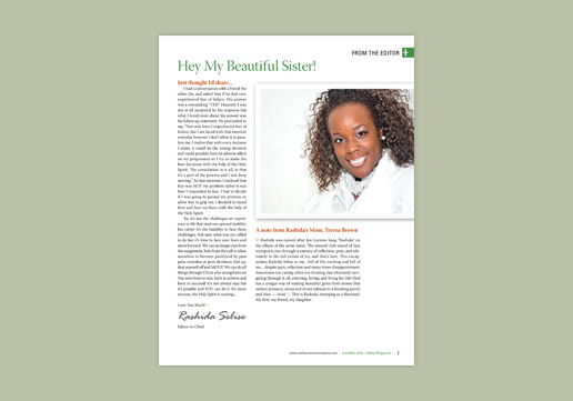
Selise Magazine
The Editor's letter for the first edition of Selise Magazine.
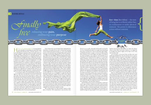
Selise Magazine
In this feature article spread for Selise Magazine, the text stagers with the ripples of the sheet, the green from the photo is mimicked as a pop color throughout the spread, the chain separates the image from the text area, and the placement of the byline is in the exploding link.
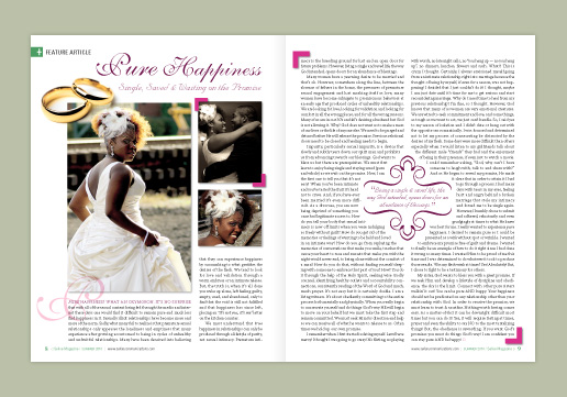
Selise Magazine
In this feature article for Selise Magazine, we used flat and dimensional graphics to create depth and interest. The pull quote frame matches the title font, and the photo edges repeated on both pages help to tie it all together.
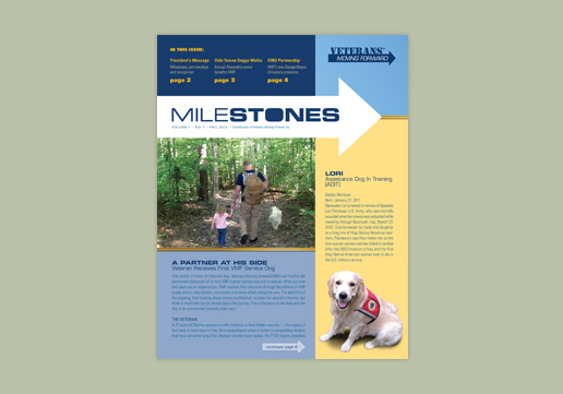
Milestones | GD USA Award Winner
Milestones is the newsletter for Veterans Moving Forward (VMF). We designed the Milestones' logo, layout and architecture for the newsletter based on VMF's brand. We work closely with their editor to design and manage print production and mailing for the newsletter as well.
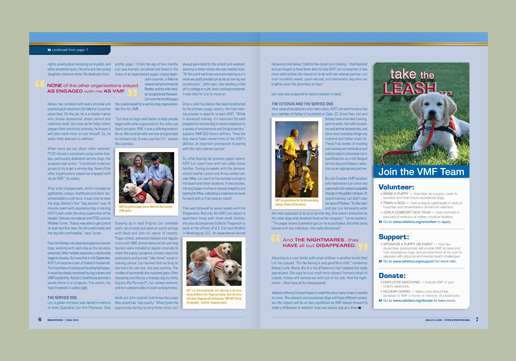
Milestones | GD USA Award Winner
Pull quotes and good sized photos help aid in breaking up the text for the feature article for the first issue of Milestones. We use a play on the phrase "Take the reins", in combination with the cute photo in the ad to inspire volunteers to join the VMF team as puppy raisers.
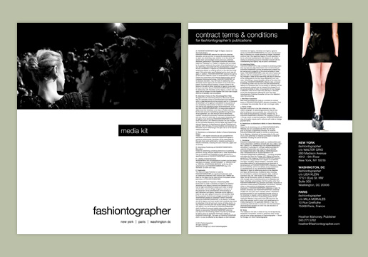
Fashiontographer
The photos by Walter Grio make it easy to design for Fashiontographer's Media Kit. Shown here are the front and back cover with simple black and white design.
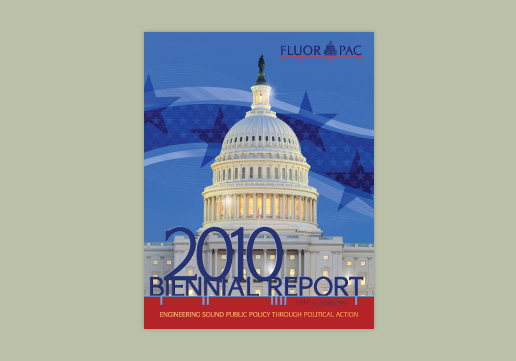
FLUOR PAC
For the 2010 Biennial Report, we removed the statue in the photo so it would not distract from the title and added light flares to windows. We create depth and interest by adding the stars and stripes behind the building and the title in front. Finally, we tie into their brand using the colors and design elements of their logo.
FLUOR PAC
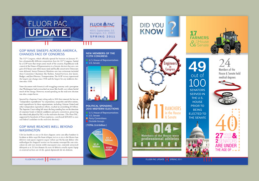
Here is a front cover of the FlUOR PAC newsletter and a fun "Did You Know" section highlighting the different backgrounds of congress members. Using stimulating images we retain the readers' attention. We also tie into the brand by using the design from the logo in the pagination architecture.
Endocrine News
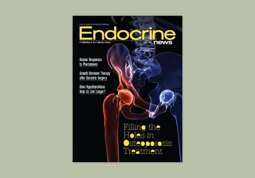
While working with Touch Three, Charlotte, President of CSE ID, art directed and designed Endocrine News, a monthly magazine for The Endocrine Society; readership 28,000. Designers love creative editor's! The feature title inspired the design for this cover.

Endocrine News
The editor sent this photo as a suggestion for the feature article, and we agreed that with its close-ups and angles that it would work well as a feature spread. For fun, we added toes to the letters to symbolize feet.
Endocrine News
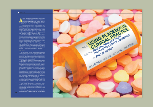
Feature title's don't always have to be boxy, boring, or found in predictable places. When the right opportunity presents itself, we fascinate the audience by incorporating the title with the photo.
Endocrine News
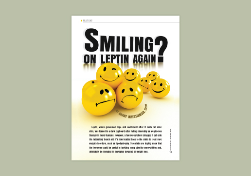
Oftentimes photo suggestions that are sent for the magazine tend to be a literal representation of the content, however, we found this abstract photo that was a perfect match for the creative title of this feature article.
Endocrine News
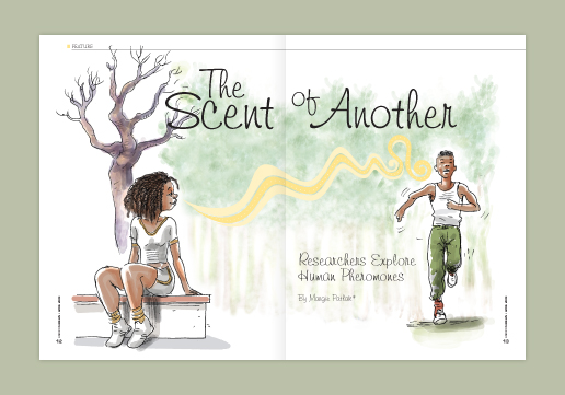
Illustration is a great way to add variety, feeling and texture to your publication. Better yet, an illustrator can provide the solution for tough concepts when the right photo cannot be found.
Endocrine News
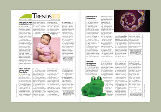
A photo that supports the text isn't always the best photo to silhouette, but we work to make different types and sizes work within the department's layout.
Endocrine News
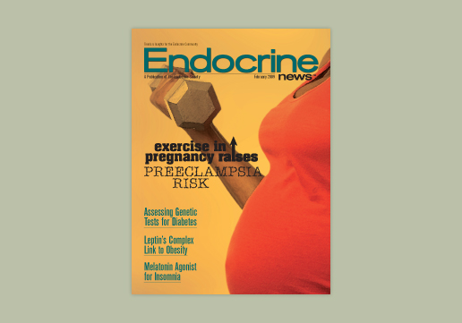
Budget constraints don't always make it possible to hire an illustrator, so a stock photo was zoomed in and manipulated in Photoshop to create an illustrated effect for this cover.
Endocrine News
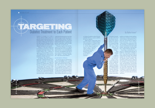
By zooming in on the man and using him and the dart to interrupt the text, we create a dramatic cover feature spread that makes the copy an intricate part of the design.

Endocrine News
Splashy two-page intro spreads are nice for feature articles, but may not always be practical. When the article is short or budget small, we can still provide clean artistic solutions.
Endocrine News
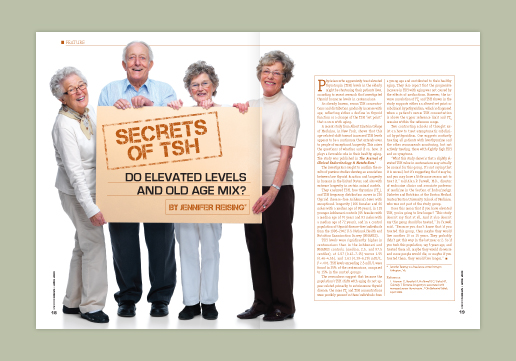
Another example of text as part of the photo.
Endocrine News
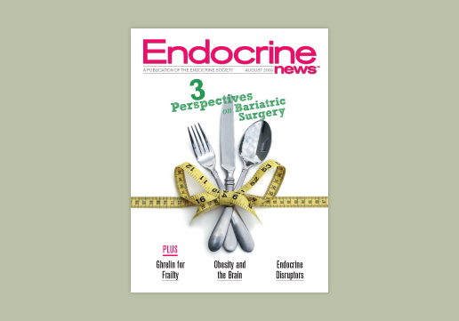
White covers can be very professional, clean and sleek.
Endocrine News
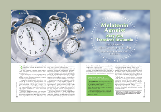
An example of a horizontal feature layout that works to conserve space.
Endocrine News
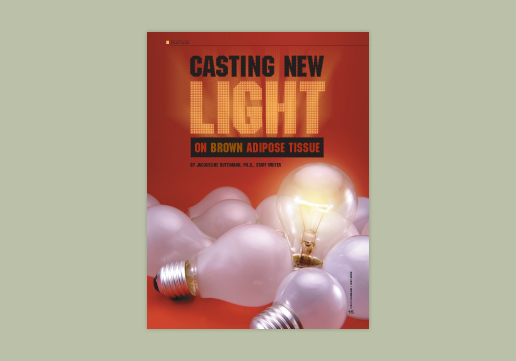
For this feature intro page, we designed the text to look like it was made up of hundreds of signage light bulbs to spotlight the title and marry it with the photo.

Endocrine News
Trends is one of the first enticing sections of the magazine that is action packed with fresh photos and quick news for an easy read.
Deck World
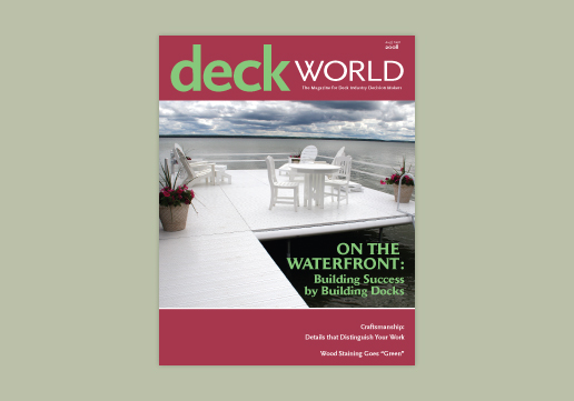
While working with Touch Three, Charlotte, President of CSE ID, designed the Aug/Sept issue of Deck World, a magazine for The American Fence Association; readership 17,000.
Deck World
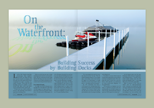
The water in the photo provided an opportune space for the headline and the reflection of the headline. The dividing line between the photo and copy area is designed to look like aluminum decking, which the article is promoting.

ACC Docket
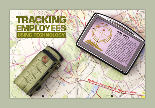
While working with Touch Three, Charlotte, President of CSE ID, assisted in the design of ACC Docket, a monthly magazine for the Association of Corporate Counsel; readership 35,000. This feature article spread combines photography and illustration to accurately represent healthcare mergers and acquisitions.
ACC Docket
The GPS device was a unique way to display the intro paragraph for this feature article about employee tracking. The headline was adorned with a dotted route line.

ACC Docket
Another example of an ACC Docket feature spread.
ACC Docket
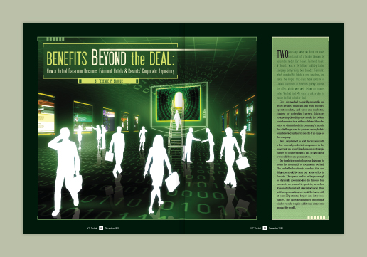
This feature article is about advantages of virtual data rooms.
ACC Docket
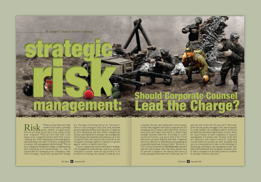
Several photos were used to hide bombs, dynamite and grenades around the three dimensional word "risk" to reinforce the toy soldier theme.
Facilities Manager
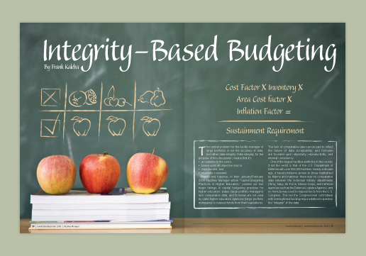
While working with Touch Three, Charlotte, President of CSE ID, assisted in the design of Facilities Manager, a magazine for APPA; readership 13,000.
Facilities Manager
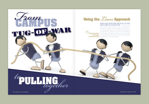
A tilt of the photo created an atypical layout and tension that plays up the headline.

On the Avenue
This two color newsletter highlights staff, residents, current events, news, and history of this retirement residence located in the heart of Washington, D.C.
NAMI Northern VA's 2015 Annual Report | GD USA Award Winner
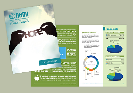
We worked with NAMI NOVA pro bono to produce their 2015 Annual Report. The cover photo we selected reflects their vision, "A world where everyone affected by a mental health condition has a place to turn for help, hope and support." We used both provided and stock photos and created graphs for stats and financial data.
<Playback Stop Play >
- Publications// 1/ 2/ 3/ 4/ 5/ 6/ 7/ 8/ 9/ 10/ 11/ 12/ 13/ 14/ 15/ 16/ 17/ 18/ 19/ 20/ 21/ 22/ 23/ 24/ 25/ 26/ 27/ 28/ 29/ 30/ 31/ 32/ 33/ 34/
- << Previous | Next >>
Publications
Whether it is a monthly magazine or a quarterly newsletter, we can help get your project done. We work with editors to produce publications from start to finish by flowing writer’s copy from Word documents into our InDesign files, designing the publication from front to back, implementing author edits, preparing the imposition, pre-flighting and placing ads, and file delivery to the printer.
We read the articles and pair design to headlines and concepts to help catch the reader’s attention and drive the point home while keeping in mind the target audience.
We can work with new publications to discover your magazine’s image, design department and feature styles, produce sidebar, folio and pull quote treatments, develop masthead and cover look. Or we can follow your current magazine’s existing style guidelines taking care to be consistent with its customs and habits.


