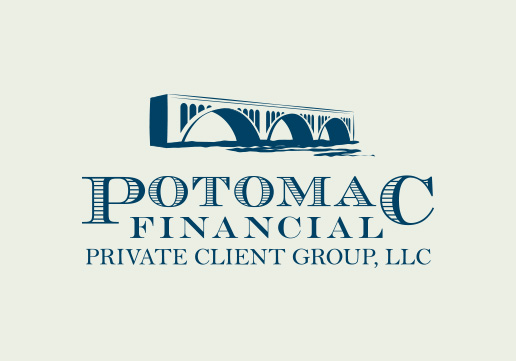
Potomac Financial Private Client Group
Our client wanted a new logo that reflected their local roots and was professional and classy. We married the Key Bridge, which spans the Potomac River, with fonts that mimic those found on American money. The bridge also symbolizes a safe path for their client's financial goals.
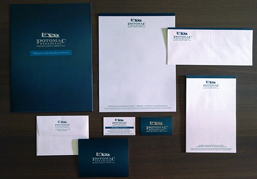
Potomac Financial Private Client Group
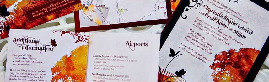
We incorporated a subtle webbing (seen in following close-ups) that mimics that found in American money into the stationery design: 9" x 12" Pocket Folder, 8.5" x 11" Linen Letterhead, #10 Linen Envelope, A2 Linen Note Card and Envelope, 8.5" x 5.5" Linen Note Pad, and Silver Foil Stamped Silk Business Cards.
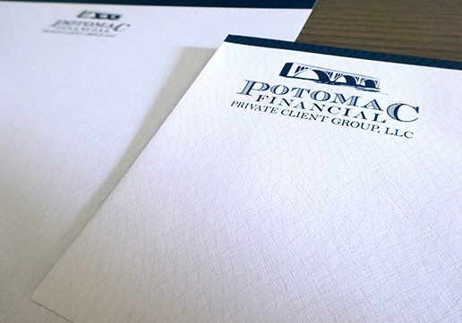
Potomac Financial Private Client Group
Close-up showing webbing: 8.5" x 11" Linen Letterhead & #10 Envelope with full bleed printing.
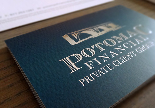
Potomac Financial Private Client Group
Close-up: 2" x 3.5" Silver Foil Stamped, 16 PT, Silk Business Cards
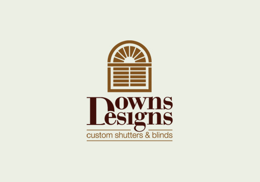
Downs Designs
This mark depicts a simple yet beautiful sunburst shutter paired with an intricate text combination that shares a single "D" for both words. The hardest part was making the text align perfectly which required interrupting the "D" to allow the "e" to overlap.
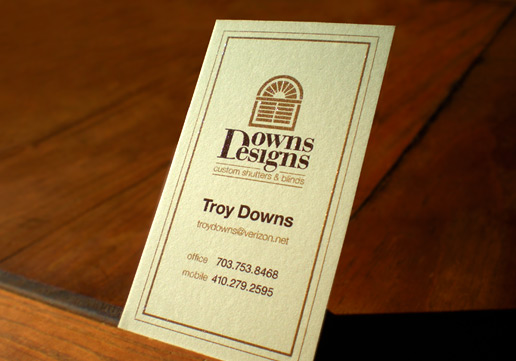
Downs Designs
These raised-ink business cards were thermography printed, a process that dusts freshly printed ink with a powder compound, then heats them together to cause the ink to swell or raise, simulating the look of engraving.
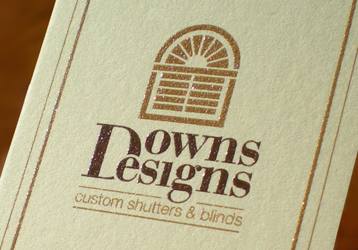
Downs Designs
A close up of the raised-ink thermography printed business cards.
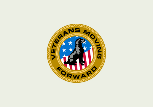
Veterans Moving Forward
A non-profit public charity whose mission is to provide service dogs to veterans with physical and mental health challenges, run by veterans for veterans. We used a sitting dog at attention to represent an assistance dog, the American flag to convey patriotism, and the artillery braid and rope commonly used in the military logos for the services.
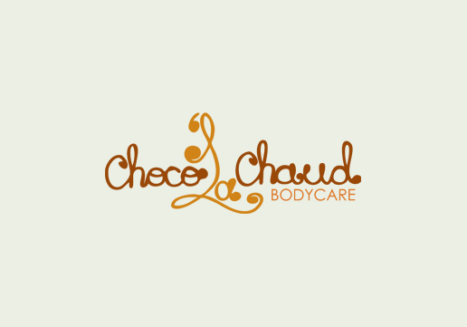
Choco la Chaud | GD USA Award Winner
This chocolate shop start-up decided to join the cupcake craze, later adding a chocolate body care line as well. The design was inspired by the look of icing piping. Chocolate and caramel mmmmmmmm.
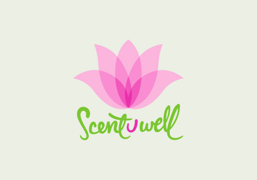
Sent U Well | GD USA Award Winner
This green cleaning start-up sells homemade green cleaning products and services suitable for those with allergies and promotes overall wellness. The lotus flower represents freshness and cleanliness.
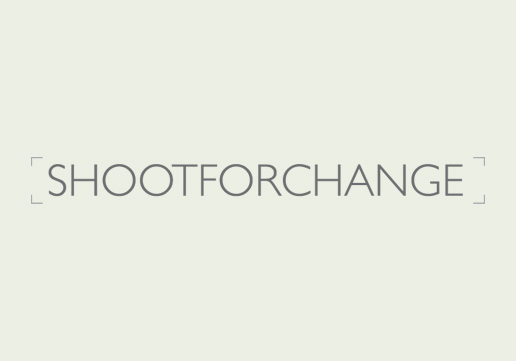
Shoot for Change | GD USA Award Winner
This logo was done for photographer, Walter Grio, who uses photography to raise money for various non-profit organizations. He takes no money for his efforts, instead all the money from every photo shoot he does goes to a nonprofit organization. So far Shoot for Change has raised over $100,000. Learn more at: shootforchange.com.
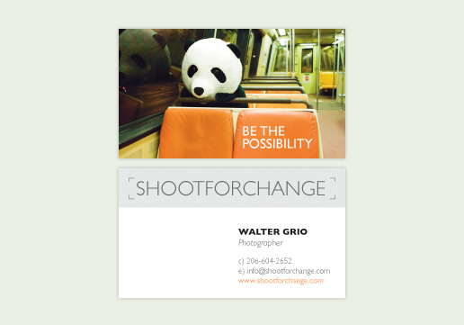
Shoot for Change | GD USA Award Winner
This business card was done for photographer, Walter Grio, who uses photography to raise money for various non-profit organizations. He takes no money for his efforts, instead all the money from every photo shoot he does goes to a nonprofit organization. So far Shoot for Change has raised over $100,000. Learn more at: shootforchange.com.
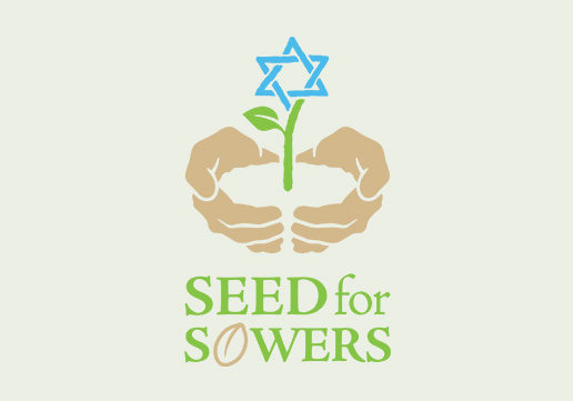
Seed for Sowers
Logo for Seed for Sowers Charitable Organization Inc., a non-profit organization who exists to support and help cultivate localized Israeli Messianic Jewish humanitarian-aid projects.
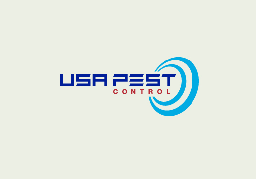
USA Pest Control
This company wanted their logo to be professional and modern, while staying away from dead bug imagery. We decided a target would convey control, and by turning it on its side combines to form spray or heat waves, which are two types of green non-toxic treatments the company offers.
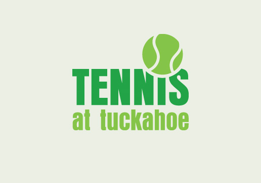
Tennis at Tuckahoe| GD USA Award Winner
"Dot your i's and cross your t's". We wanted to replace the dot in the "i" with the tennis ball, but also needed the ball to be large enough to stand as the icon of the logo. We achieved this by knocking out the tops of the "N" and "S".
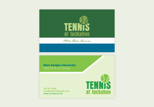
Tennis at Tuckahoe| GD USA Award Winner
For this two-sided business card, we took a minimalist approach using color fields on the back to represent the tennis court.
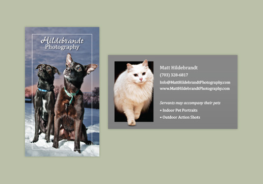
Pet Photography Business Cards
For this photographers business card, we let the photography take the lead and left the design simple. To add depth to the cat photo, we selected out her foot and fur to make it look like she was stepping out of the card.
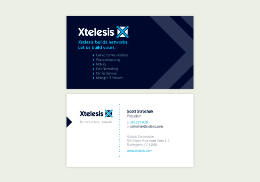
Xtelesis
The X and triangle from Xtelesis logo were used to create positive and negative space in the redesign of their business cards providing a face lift to the brand.
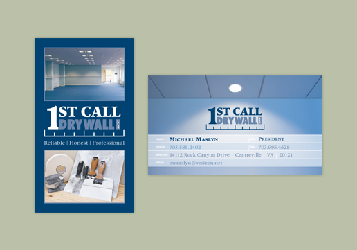
1st Call Drywall
"Measure twice, cut once." For this drywall and acoustical ceiling contractor we designed a logo with ruler marks to convey professionalism and found a great photo whose focus is both on the wall and ceiling. The spot lighting was perfect to showcase the new logo.
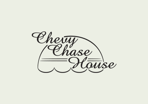
Chevy Chase House
This retirement community is known for its awning that shelters the walkway to the front entrance. Using this iconic image, we incorporated the typeface in the original logotype to form the updated logo.
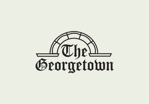
The Georgetown
The Georgetowns original logo didnt convey the feel of Georgetown so we paired a Palladian arch with the original typeface to create this updated logo.
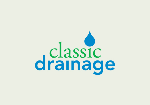
Classic Drainage
The water droplet that dots the i is draining through the grass green type to the pipes below.
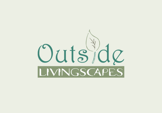
Outside Livingscapes
For this landscaping company we used two tones of green to capture the many shades found in nature and delicate fonts reminiscent of flowers. A leaf forms the I providing iconography.
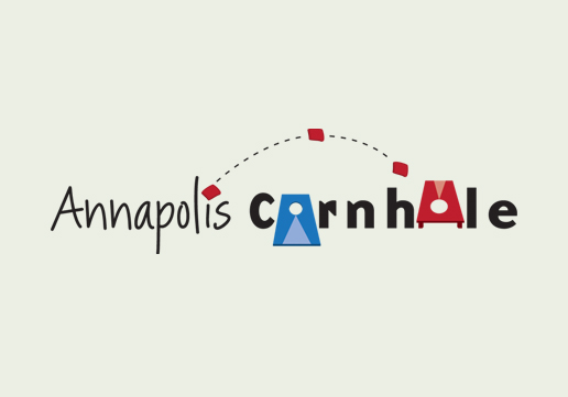
Annapolis Cornhole
A friend asked us to create a logo for their league using cornhole boards in place of the Os. We furthered the idea with the added bean bags.
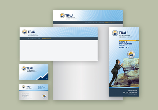
The Retirement Advisor University
TRAUs Stationery package includes letterhead, business card, number 10 envelope, and tri-fold brochure design.
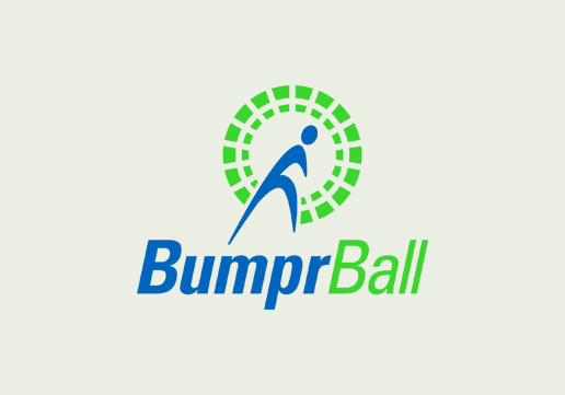
BumprBall
Bumper Ball or Bubble Ball is a new sport where players wear a bubble suit around their body so they can run into each other on the field. This Nike inspired logo for the new sport shows motion and impact in the angle of the man and text while capturing the construction of the ball itself.
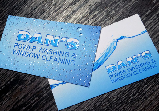
Dan's Power Washing and Window Cleaning
We wanted these 16PT silk laminated business cards to look wet so we added a layer in the design for Raised Spot UV Coating, which is seen when the light catches the water droplets at certain angles. Added benefit the texture will catch the clients attention.
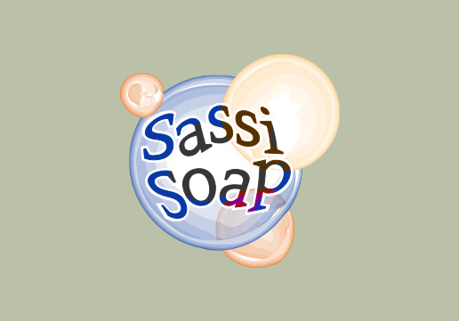
Sassi Soap
Sassi Soap had used one of the free logos from Vista Print which was very flat and geometric we took the idea up several notches, giving it a 3D watercolor effect and incorporating the text into the image.
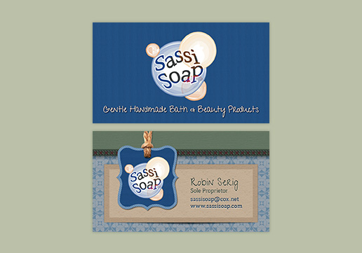
Sassi Soap | GD USA Award Winner
We used the design elements that we created for Sassi Soap's ecommerce website to reinforce the brand in their business cards.
Corporate Identity
Identifying your companies brand identity is one of the most important steps in marketing your company. Your logo will represent you and will help your audience recognize your company and everything it stands for across all forms of media and advertising.
